
What is the impact of a User Interface (UI) on human error?
Let’s face facts, humans are the most likely component to add an error into a system. They can become complacent, bored and switch off, even momentarily, leading to errors. And when it’s a repetitive task they are being asked to perform, the chances of something going wrong is much higher.
Let’s be clear, what is human error?
It is defined by Merriam-Webster as: “A person’s mistake rather than on the failure of a machine”
Nielson Norman Group’s article by Page Laubheimer touches on where to apportion blame for a human error – does it lie with the user or with the designer of the system? The article states that ‘the designer is at fault for making it too easy for the user to commit the error … and therefore the answer is to redesign the system to be less error prone.’
The article goes on to define two types of user error: slips and mistakes. Slips occur when the user is on autopilot and may inadvertently, for example, key in an ‘o’ instead of a ‘p’. Whereas a mistake is a conscious error and stems from a misunderstanding of the original goal.
What are the consequences of using a poorly-designed User Interface (UI)?
There is of course, considerable impact to using a poorly-designed UI – namely your bottom line, and you can’t really afford to get it wrong. There is lost production with staff taking longer to perform tasks as well as taking longer to train initially. Add to that staff stress, possible late deliveries, creating unnecessary waste, fines and scheduling for expensive rework, all need to be taken into account and kept to an absolute minimum.
Can you spot a bad UI?
h2o-digital.com has listed the following as traits of a bad UI:
- Sluggish and unresponsive – interaction will be slow and clunky
- Complicated – hard for people to understand
- Confusing – unclear about where the user should go next
- Inconsistent design – pages will look different, throwing users off
- Readability issues – font size too small, inappropriate font selection, poor colour schemes.
So, how do we get it right and support our fellow human being?
Well, to start with a well-designed UI would go a long way to reducing initial errors and keep the production line running.
“Good design, when it’s done well, become invisible. It’s only when it’s done poorly that we notice it”. Jared Spool
There are many design features to take into account and kit has to be selected which is right for your particular circumstances and workforce.
Below are a few features you may wish to consider before making your final decision:
- Are the screens uncluttered and easy to navigate?
- Is there synergy between the screens so you know where you are and where you have been?
- Are there options to create different level logins to control access?
- Is the User Interface customisable for quick and easy access to popular functions?
- Does the User Interface show simple graphical guides for support?
Everyone’s a winner
It should be clear that by investing in a product with a solid UI with proven design qualities, you will be providing your customers with reliable, accurate deliveries whilst reducing your internal costs. Staff will be more productive, confident in their abilities and waste will be minimised, together with expensive rework and costly downtime.
Don’t underestimate the effect a happy, productive workforce has on your brand. Staff feel valued when they appreciate time and effort has been spent on sourcing the best possible equipment to help them do their job, and the ‘good will’ this generates, although not always easy to measure, will have a positive impact on your bottom line.
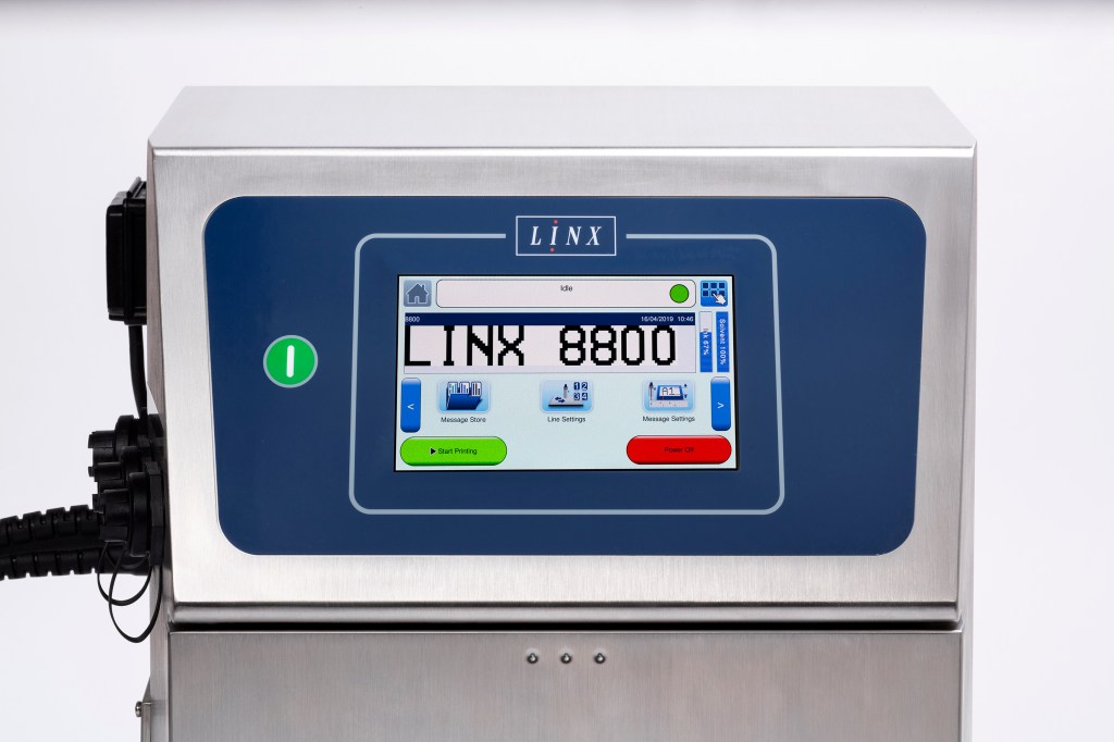
Watch our video to see how easy an 8800 printer is to use